Embed Dashboard > Appearance
Match a Draxlr dashboard embed to your product with custom colors, fonts and CSS, including the available selectors and the styles that need !important.
Open Appearance in the embed builder to match the embed to your product. It has three sections: Customize Colors, Customize Fonts and Custom CSS.
Click Apply to update the preview. The panel stays open, so you can keep adjusting. These settings also work when you embed a single dashboard element.
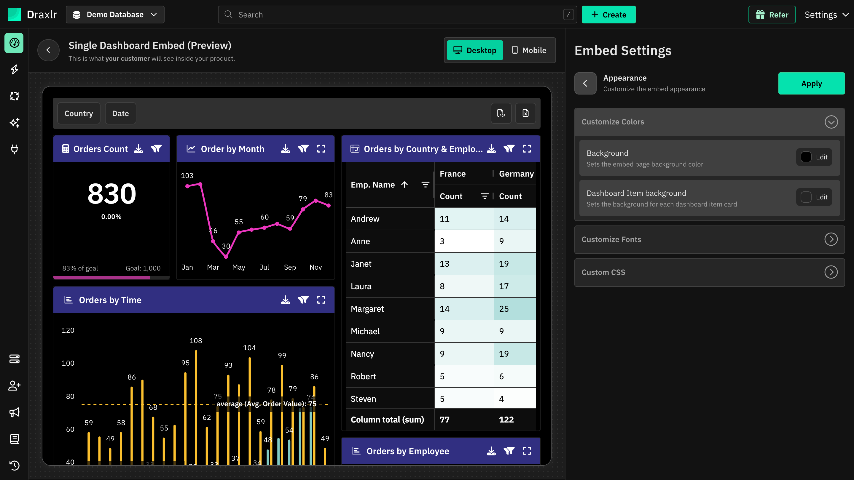
Customize Colors
| Setting | What it does |
|---|---|
| Background | The embed's page background. Draxlr picks a light or dark theme from this color. Only for dashboard embeds. |
| Dashboard Item background | The background of each dashboard element card. |
Click Edit next to a setting to pick a color.
Customize Fonts
- Custom Font Family URL: the URL of a font stylesheet, for example
https://fonts.googleapis.com/css2?family=Inter. - Font Family name: for Google Fonts URLs, Draxlr reads the name from the URL. For any other URL, enter the font family name your stylesheet defines.
The font applies to all text in the embed, including chart labels. Clear the URL to go back to the default font.
Custom CSS
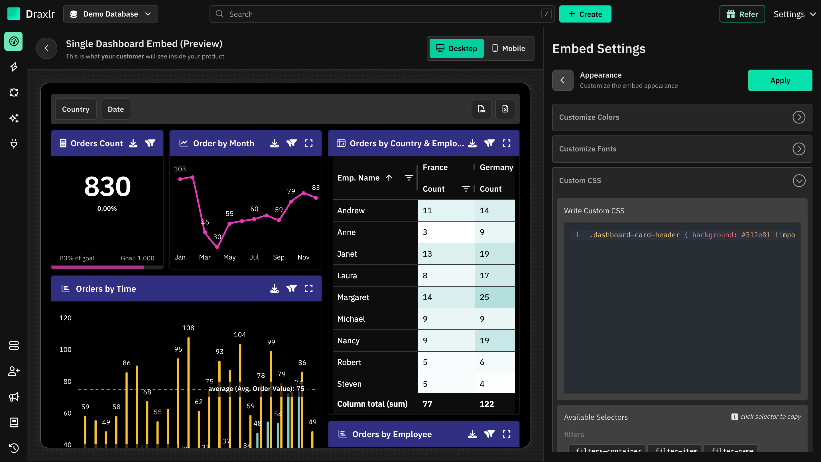
Write your CSS in Write Custom CSS. Under the editor, Available Selectors lists the selectors below. Click one to copy it.
Your CSS only affects the embed:
Draxlr scopes every rule to the embed, so it never changes anything on your own page.
What you can write:
- Combine selectors with elements and pseudo-classes, for example
.table-row:hoveror.dashboard-card-content svg. @mediaqueries work, and the rules inside them are scoped too.:rootandbodytarget the embed itself, so you can set CSS variables there.@font-faceand@keyframesare passed through unchanged.
Some styles need !important:
Draxlr sets a few styles directly on elements, mostly the colors from Customize Colors. Plain CSS can't override those, so add !important when you change:
.dashboard-card: border, border-radius and box-shadow.dashboard-card-headerand.dashboard-card-footer: background and color.dashboard-card-contentand.embed-container: background.table-header: background, color, border color and font size.table-row: background and color.filters-container: color
Filters
| Selector | Description |
|---|---|
.filters-container | The bar that holds all dashboard filters. |
.filter-item | One filter. |
.filter-name | The filter's name. |
.filter-operator | The applied operator and value, for example In: Active. Shown once the filter has a value. |
.filter-apply-button | The button with the tick icon, which applies the filter. |
.filter-cancel-button | The button with the cross icon, which cancels editing or removes the filter. |
Example:
.filters-container {
  background: #f8fafc;
  padding: 16px;
  border-radius: 8px;
}

.filter-apply-button {
  background: #2563eb;
  color: white;
}
Dashboard Card
| Selector | Description |
|---|---|
.dashboard-card | The whole dashboard element card. |
.dashboard-card-header | The card's header. |
.dashboard-card-header-icon | The element type icon at the start of the header. |
.dashboard-card-header-query-name | The element's name. |
.dashboard-card-header-query-description-icon | The info icon next to the name, shown when the element has a description. |
.dashboard-card-header-search-icon | The search icon in the header. |
.dashboard-card-header-search-input | The search box that opens from the search icon. |
.dashboard-card-header-filters-icon | The filters icon in the header. |
.dashboard-card-header-expand-icon | The full-screen icon in the header. |
.dashboard-card-content | The area under the header that shows the chart, table or value. |
.dashboard-card-footer | The footer with pagination and the total. Only on tables that show them. |
Example:
.dashboard-card {
  border-radius: 12px !important;
  box-shadow: 0 4px 16px rgb(0 0 0 / 10%) !important;
}

.dashboard-card-header {
  background: #312e81 !important;
}

.dashboard-card-header-query-name {
  font-weight: 600;
}
Table
These apply to Table elements.
| Selector | Description |
|---|---|
.table-header | Each column header cell. |
.table-row | One table row. |
.table-cell | One table cell. |
.table-pagination | The page controls in the card footer. |
.table-total | The total row count in the card footer. |
Example:
.table-header {
  background: #1e293b !important;
  color: white !important;
}

.table-row:hover {
  background: #f1f5f9 !important;
}
Embed Container
These aren't available when you embed a single dashboard element.
| Selector | Description |
|---|---|
.embed-container | The embed's outer container, which shows the page background. |
.embed-content | The area inside it that holds the filters and dashboard elements. |
Example:
.embed-container {
  border: 1px solid #e2e8f0;
  border-radius: 12px;
}
In the API request
The embed code sends these settings in configuration. If you write the request yourself, use these fields:
| Field | Type | Description |
|---|---|---|
backgroundColor | string | Page background color. Only for dashboard embeds |
cardBackgroundColor | string | Background color of element cards |
appearance.fontFamilyUrl | string | URL of the font stylesheet |
appearance.fontFamilyName | string | Font family name to apply. Required for the font to apply; the builder fills it in for Google Fonts URLs |
appearance.customCss | string | Your custom CSS |
See Generate Embed URL API for the full request.
Full App Embed uses the same CSS:
The selectors and !important rules on this page also apply to dashboards in Full App Embed.